This isn’t the first time that I’ve decided to have a look at the finish times for a running race: you can find previous analyses of the Glasgow Half Marathon and the Edinburgh Marathon. In this post, I wanted to have a look at an altogether different kind of race: the Tinto Hill Race. At 6.7km and 475m of climb, it’s by no means the biggest of hill races, but it was the first one I ever ran, so it makes sense to look at it first.
The data
I’ve collected the results for the race for every year it ran between 1985 and 2025; like just about everything else it took a year off in 2020. That means that I have over 7000 finish times to analyse, which should allow for some insights.
Finish times
The first thing I did was simply to look at the distribution of finish times, which allows a quick visualisation of what the average time taken to complete the route is.
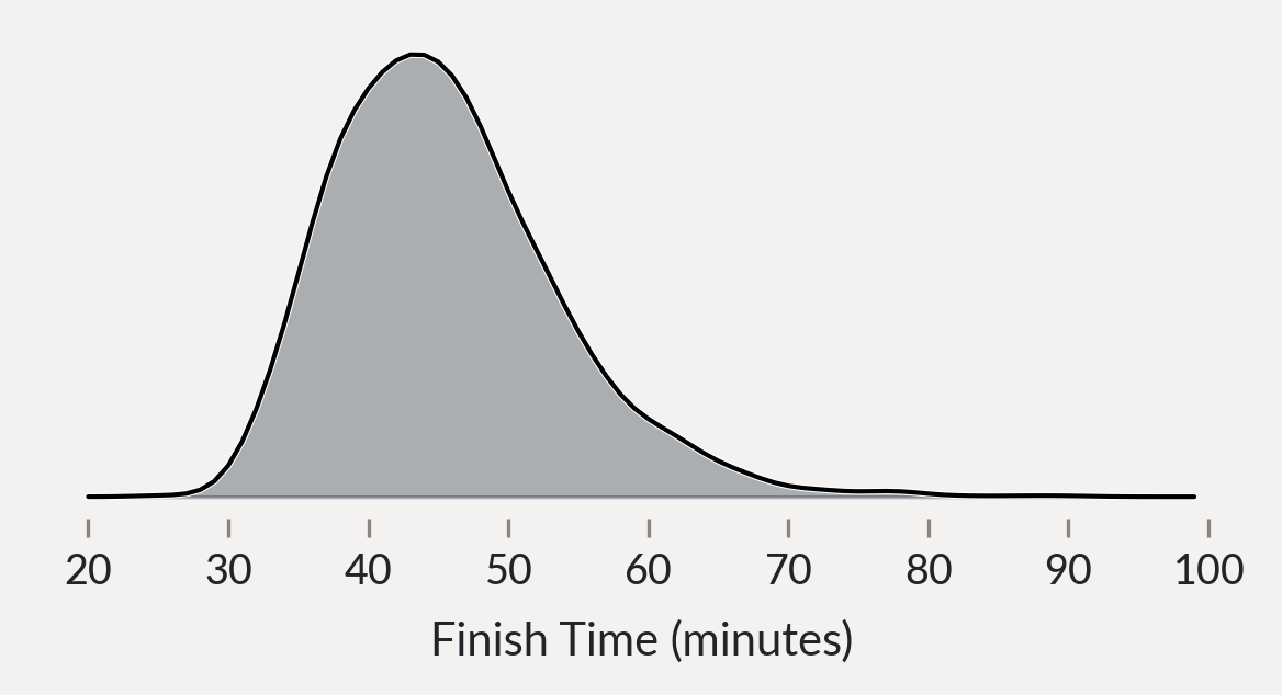
The median sits at just over 44 minutes (my own PB is 41:55, so I was hoping for this to be a bit higher!), but there’s a long tail with the slowest finishes coming in at over an hour. So, in a sense the simple answer to the question is “under 44 minutes”, but we can do better.
The simplest thing we can do is split the data by gender, and look at the men’s and women’s results separately.
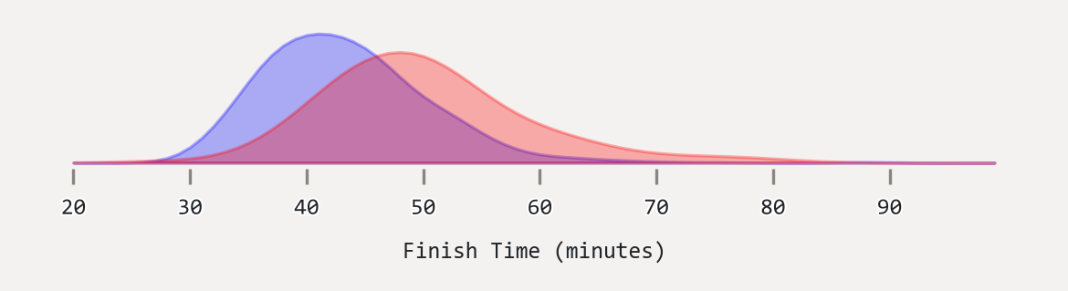
The median men’s time is then 42.15 minutes, and women’s is 48.7 minutes. So it’s already unfair to give a single answer to this question, and regular readers of the blog will be pleased that I’ve returned to form of never being prepared to give a single answer to a question where ten will do.
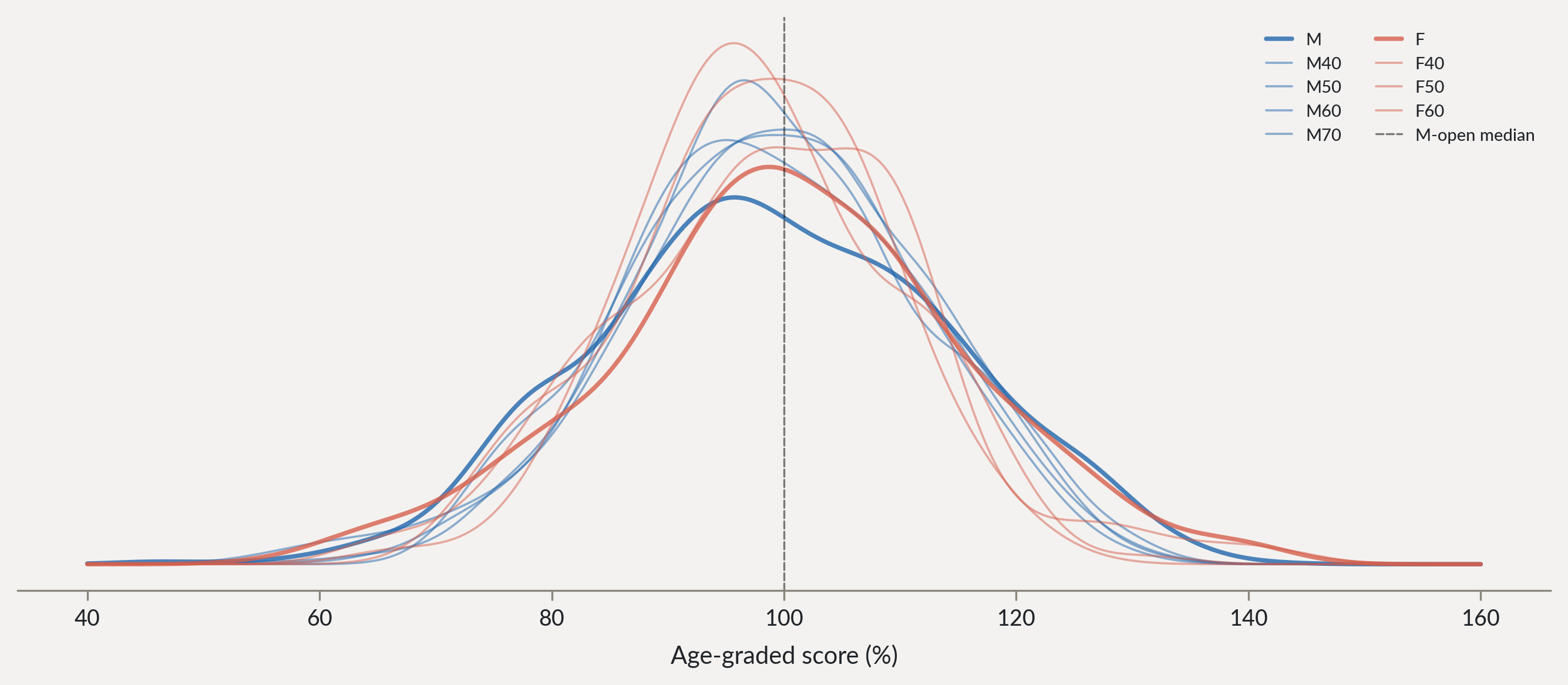
Because we have so much data from so many editions of the race we can also look at the distribution of finish times broken down by age category.
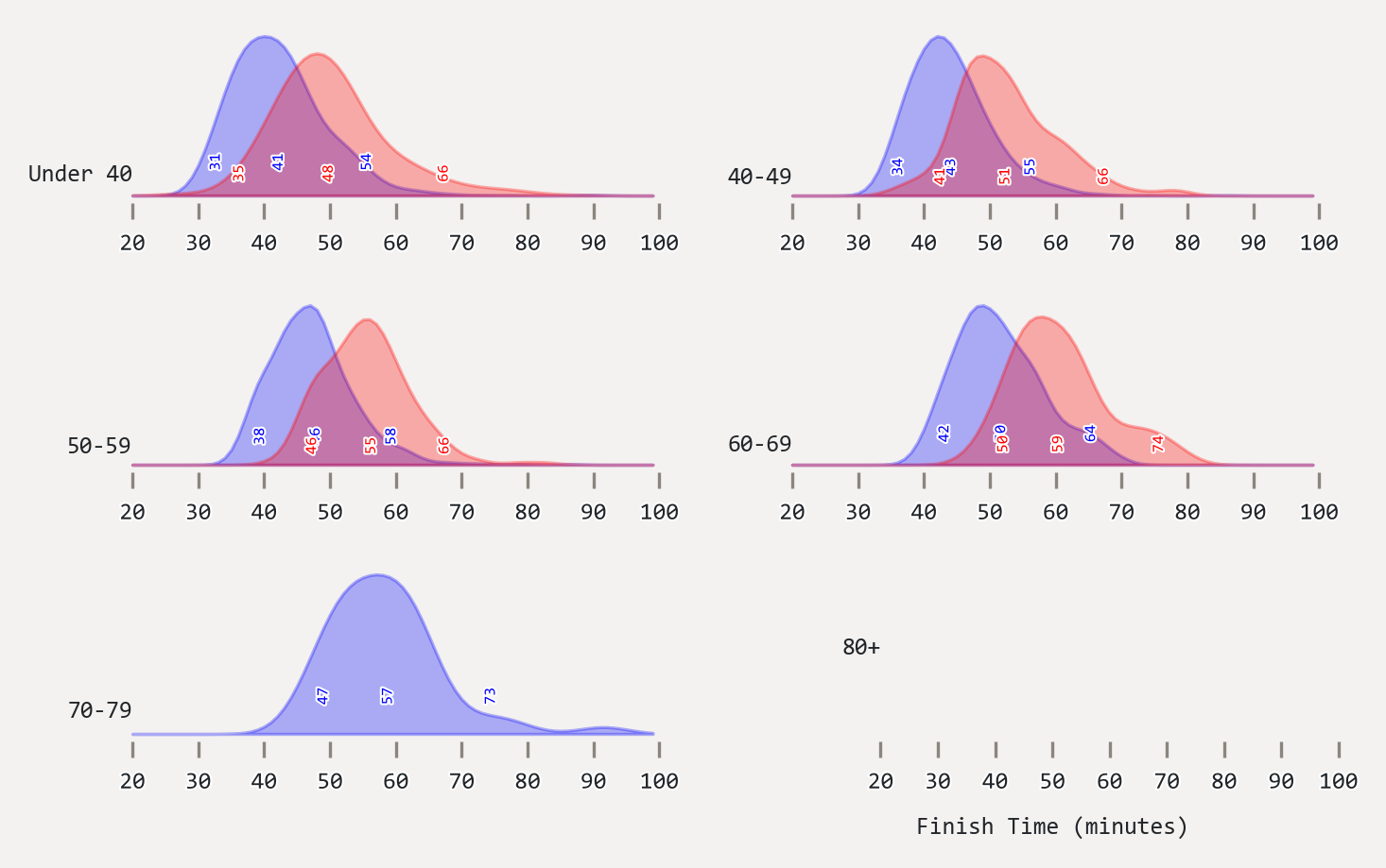
One thing which stands out here is that for every decade you can expect to become about three minutes slower, which is less of an increase than I had expected.
Further analysis
Having so much data, it makes sense to do some more sophisticated statistical modelling on the data, so I put together a Bayesian hierarchical model (more on this in a future post, I have Plans for it). The first thing this allowed me to do is to come up with a more precise estimate of the median finish time for each age category, and to give a credible interval for that estimate.
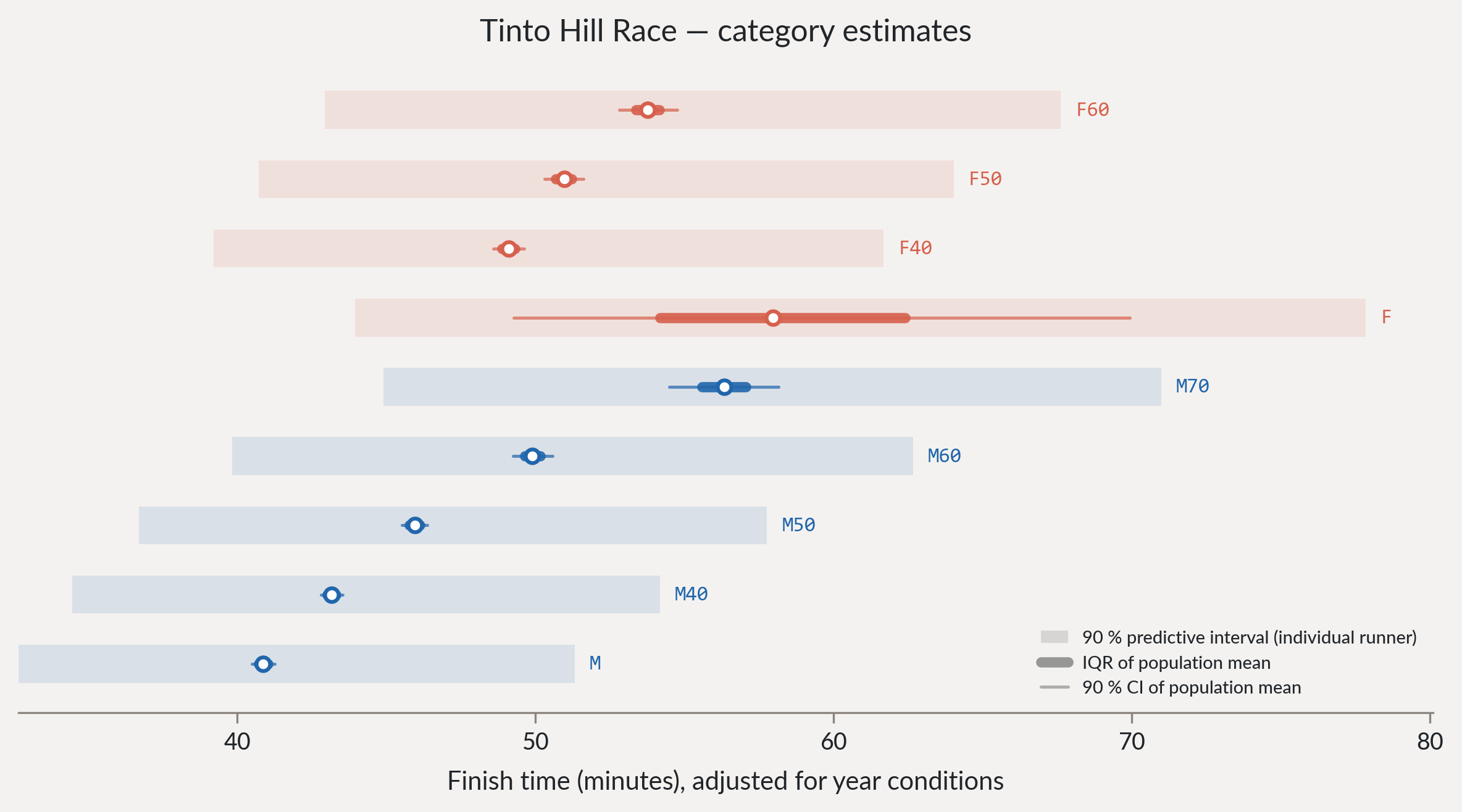
With so many observations (actual results) this doesn’t really tell us anything the data didn’t already. However, it allows us to do something more useful, which is to work out the age corrections, or age-gradings for the race. This is effectively the handicap which we can apply to a finish time to make it comparable across age categories, and is a useful way of comparing times across the different categories. We do this by taking the distribution of finish times in each category, and then working out the factor which would shift that distribution to match the distribution for the “M” category.
| Category | Factor |
|---|---|
| M | 1.0 |
| M40 | 0.95 |
| M50 | 0.9 |
| M60 | 0.82 |
| M70 | 0.73 |
| F | 0.83 |
| F40 | 0.81 |
| F50 | 0.76 |
| F60 | 0.71 |
This table allows you to convert a finish time in any category to an age-graded time, which is the equivalent time for a man in the M category. By multiplying your finish time by the factor for your category, you can get an age-graded time which allows you to compare your performance to other categories.
Has Tinto got faster?
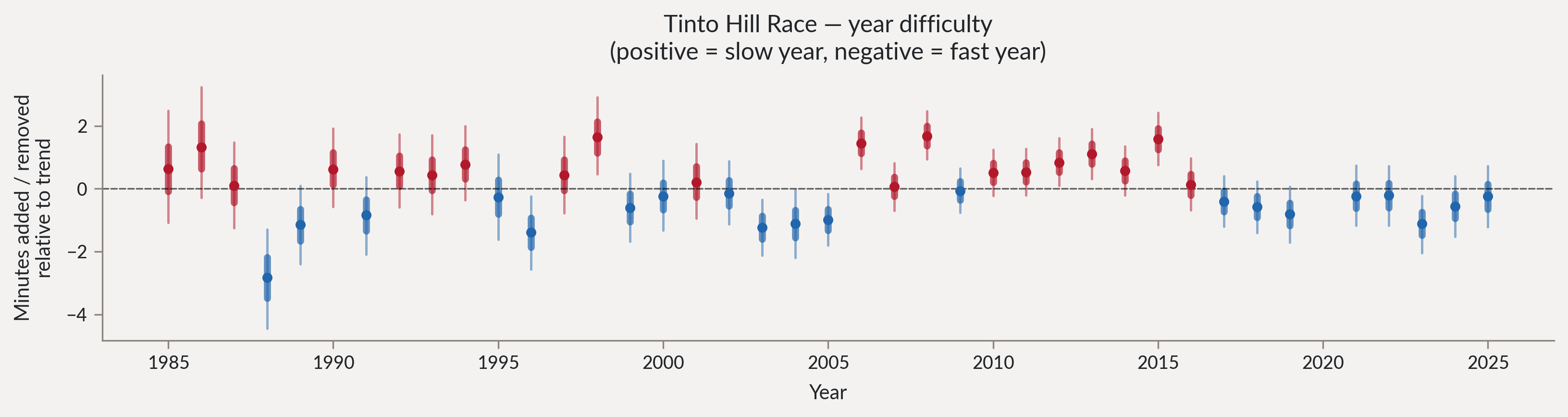
We can look at the average finish time for each edition of the race and compare them to the overall average, which gives us an estimate of how “difficult” each edition was. 1988 saw the fastest edition, while post-2017 the race has been slightly faster than the historical average, though not by a lot.
If we exclude results from 2004 then, I find that Angela Mudge holds the course record as determined by age-grading, with a score of 142.5% in 2010, with a finish time of 35:38. The men’s age-graded record is held by Andy Douglas at 141.1% in 2023 at 28:53.
So has Tinto got faster? Not really. But it’s also not really got slower, which is probably related to the fairly small field being self-selecting. A general trend for e.g. Parkrun is for times to get slower over time as more people take part, but that’s not reflected here.
What about clubs?
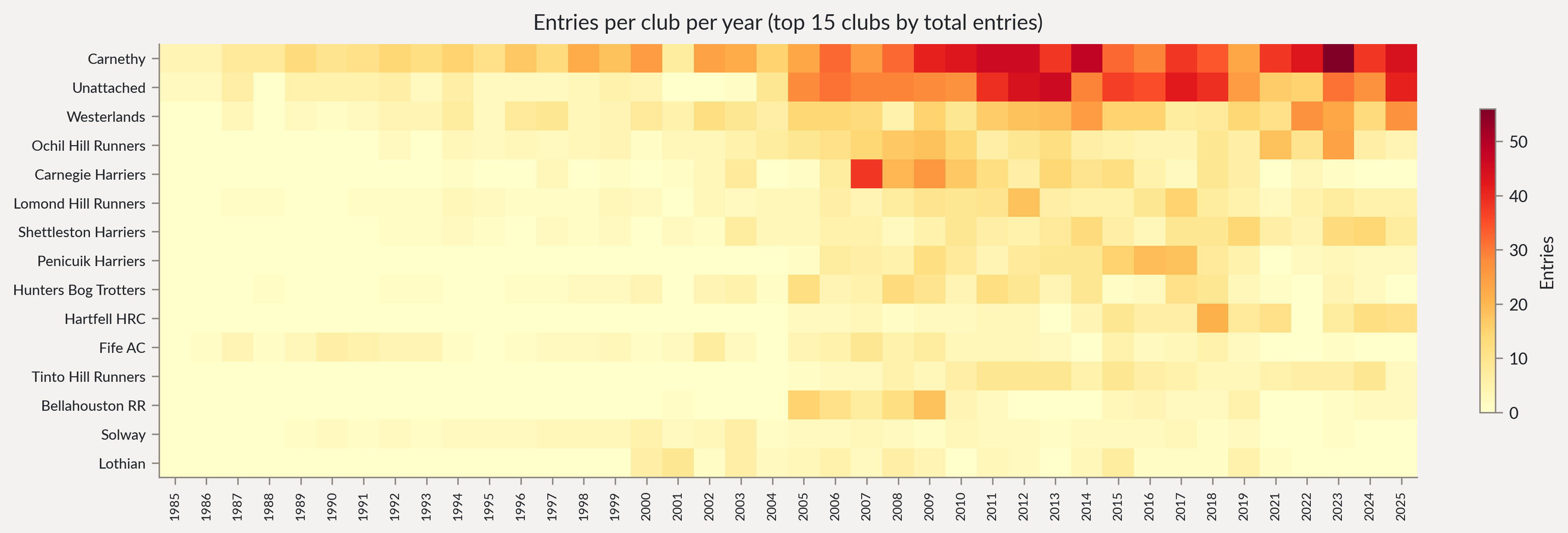
We can also look at the results and the entries broken down by club. Tinto is organised by Carnethy Hill Running Club, so it’s no great surprise to see that they have dominated the entries over time.
We can also look at the breakdown of finish times by club.
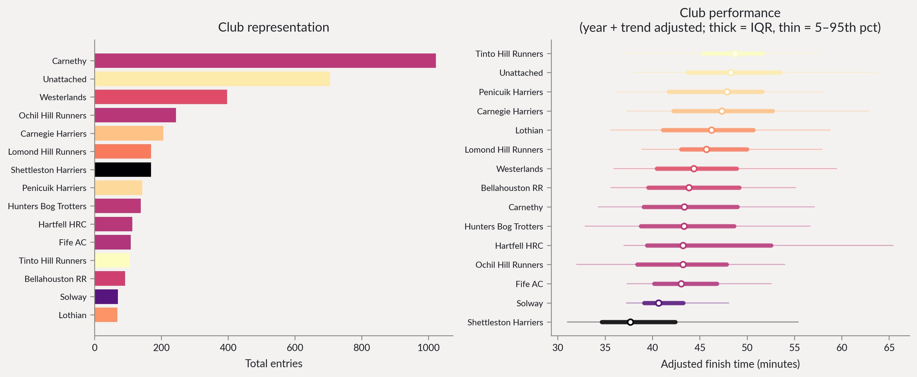
Shettleston come out on top here as the fastest club, with Ochils the fastest of the big hill running clubs.
So, what is a good time? Well, it’s one which you’re happy with, of course, but if you now want to start comparing yourself to the all-time best finishes, you hopefully now have the tools to do so.